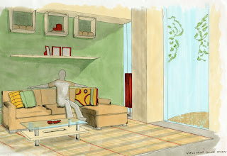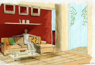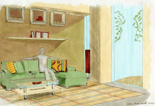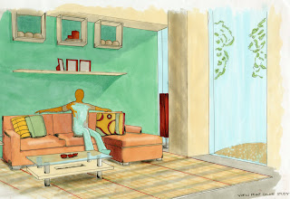

With this one I worked the most with color, shadow and highlight. On the back wall, I changed the color and overlayed it with a texture filter. I also added shadow and highlight with the burn and dodge tools. I think this one is a little "over-Photoshopped" though.

This one looks a bit more natural, but also a bit boring. I tried to play with the color balance on the back wall and couch.

Going in the opposite direction, I went for a more vibrant color scheme here. I mixed what I did in the others. (Color balance, shadow, highlight, and textures)

No comments:
Post a Comment